Deck of Cards
Depending on your preferences, the term Deck can be changed to Collection, or Table.
A Deck collects similarly structured Cards. Through the definitions of Fields, a Deck also is the place where you design the structure for its Cards.
There is no limit to how many Cards you can keep in a Deck (except in the free CE edition). With category, tags, and bookmarks, you can easily organize a large number of Cards.
Browsing through Cards (R)
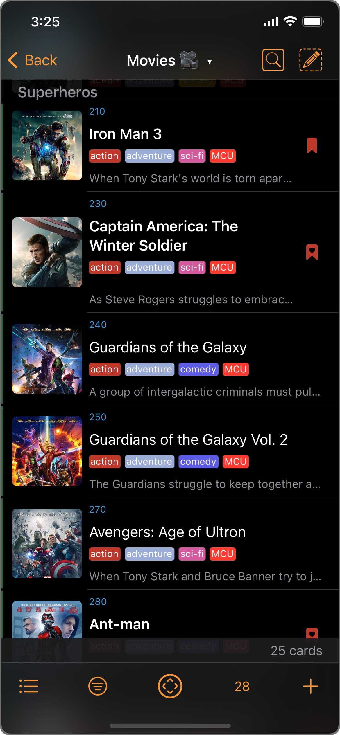
A typical Cards window showing a Deck of Cards.
Opening a Card
From the Cards list, just tap on a Card to open it.
(See Card of Entries.)
Views
A Deck can define any number of Views and Filters. A View defines how the Deck is displayed, including Listing options (e.g. grouping, sort orders) and Content options (e.g. icon size, whether tags are shown). A View also can choose one of the Deck's defined Filters as the designated Filter.
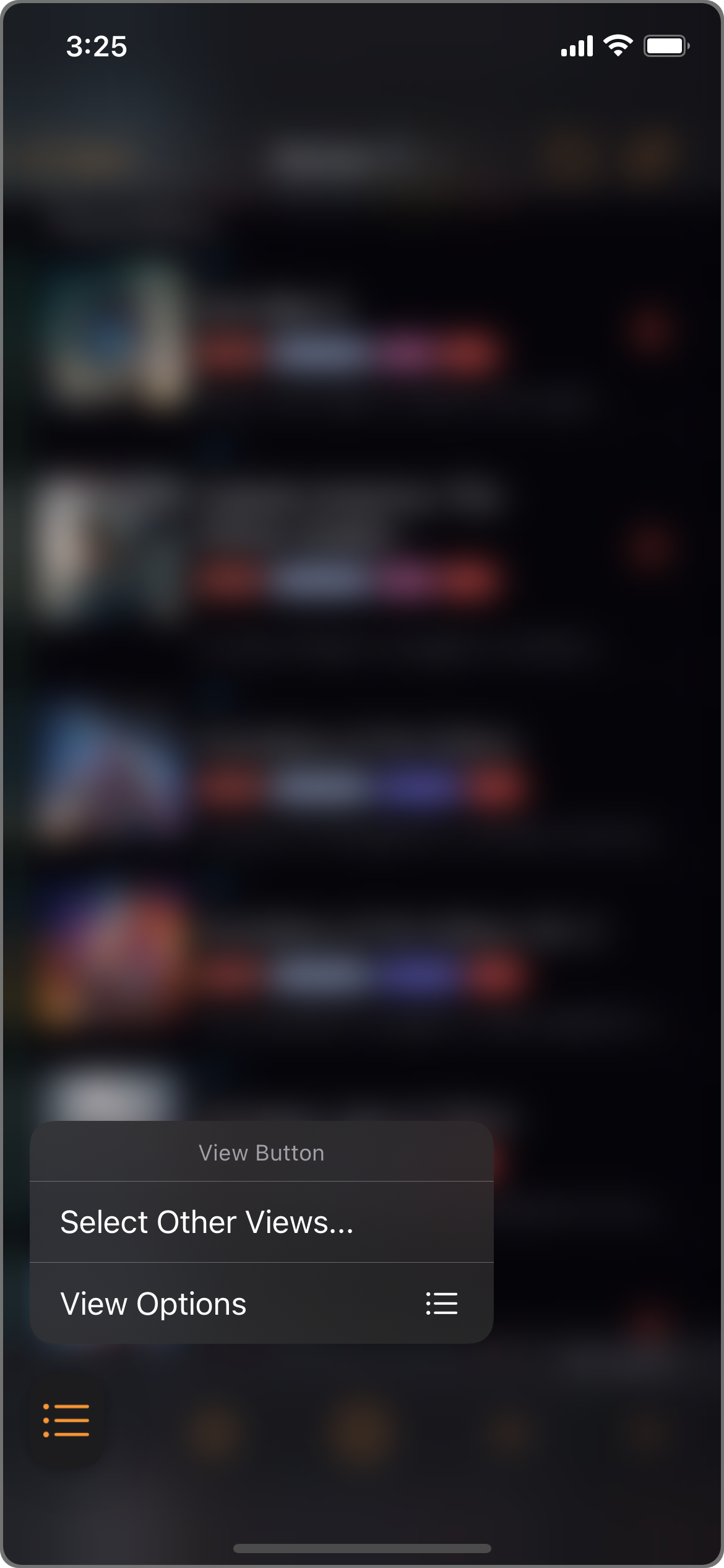
Tap the View button (bottom left) to show view options.
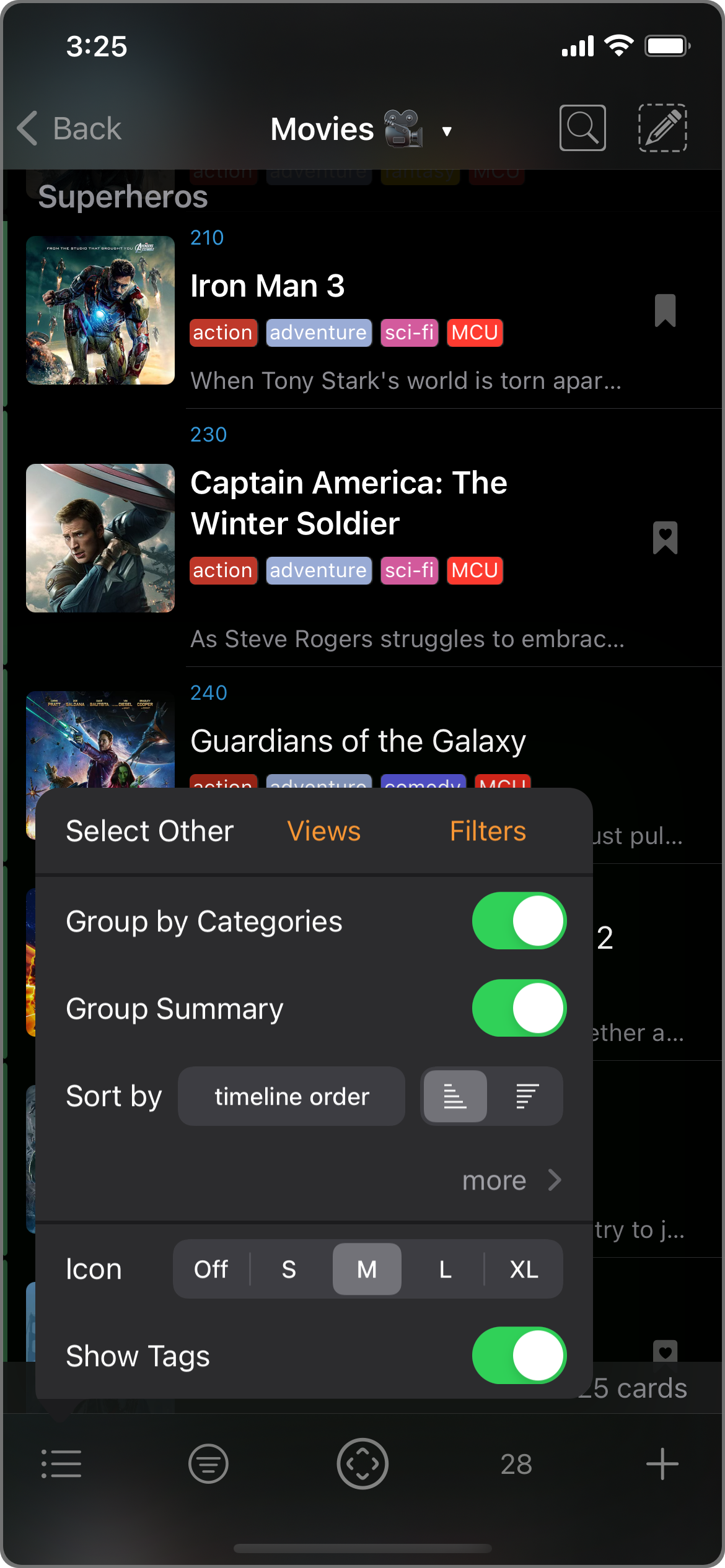
View options for the Cards window.
View options:
- Group by Categories
- This option groups the Cards by Category. You can think of it as "Sort by Category" first, like a level 0 sort option in addition to the three levels of sort options below.
- Categories will be in the order they are arranged. To change the order:
- Go into any Card and then tap on the Category row (the Card Category icon is the one with four small squares in different shades).
- Turn on Edit mode by tapping on the Edit button on the bottom right.
- Manually adjust the order by dragging on the arrange bar on the right, or sort them by names using the Sort button on bottom left.
- Finish by tapping on the Edit button again.
- Group Summary
- Sort by [Field] [Ascending/Descending]
- Each View can define up to three levels of sorting.
- Each sorting level can sort on any one of these fields in ascending or descending order:
- Name
- Notes
- Date Created
- Date Modified
- Date Accessed
- Access Count
- Links Count
- or User-defined Custom Fields
- (none): not sorted
- Icon: size
- Show Tags: Toggle to show tags.
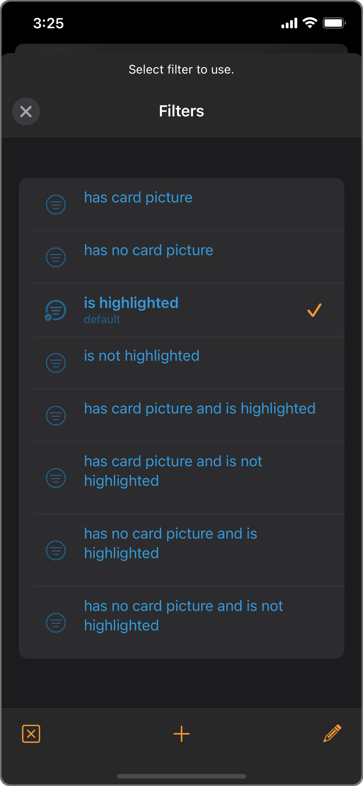
Filters
A Filter defines which Cards are included in a View.
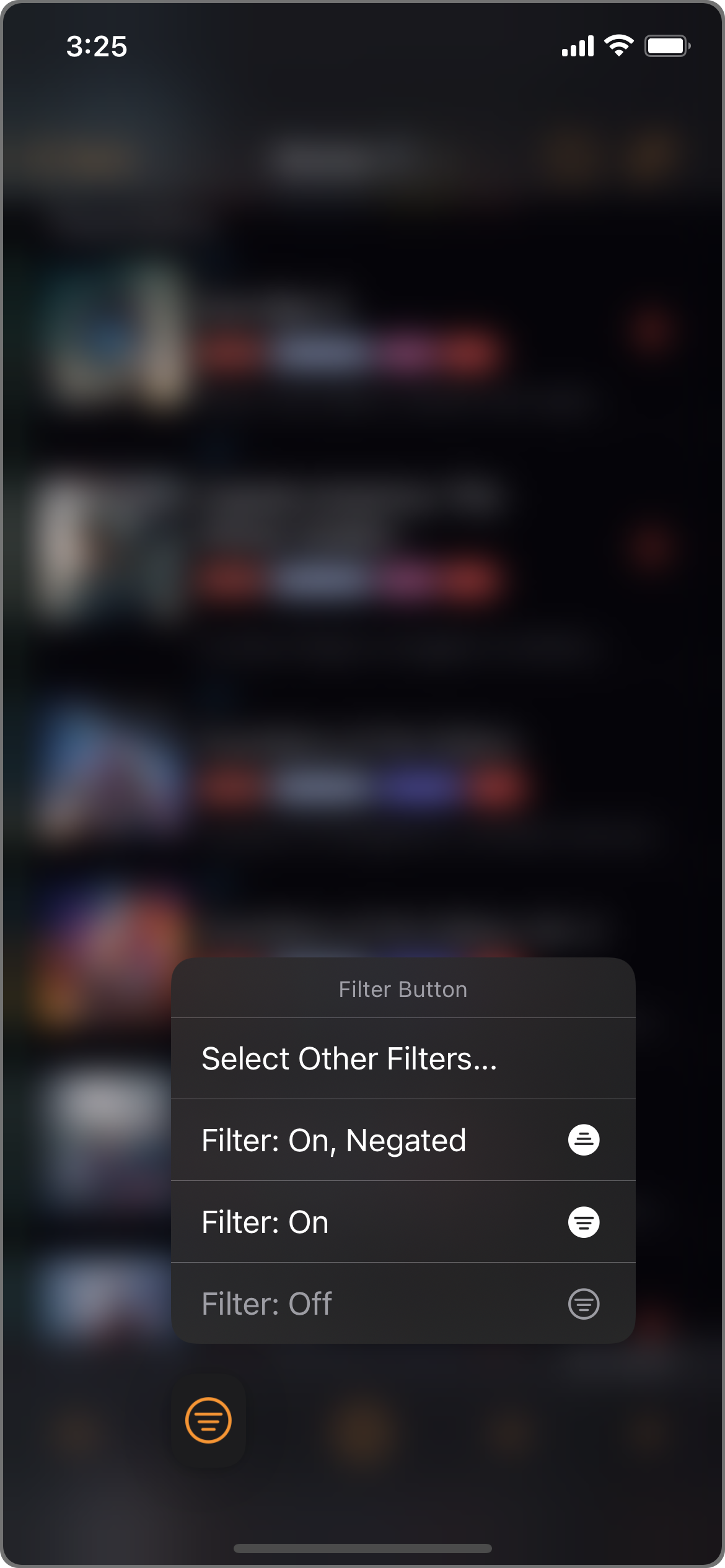
Filter options
Picker
The Picker lets you easily pick out Cards based on category, tag, or mark.
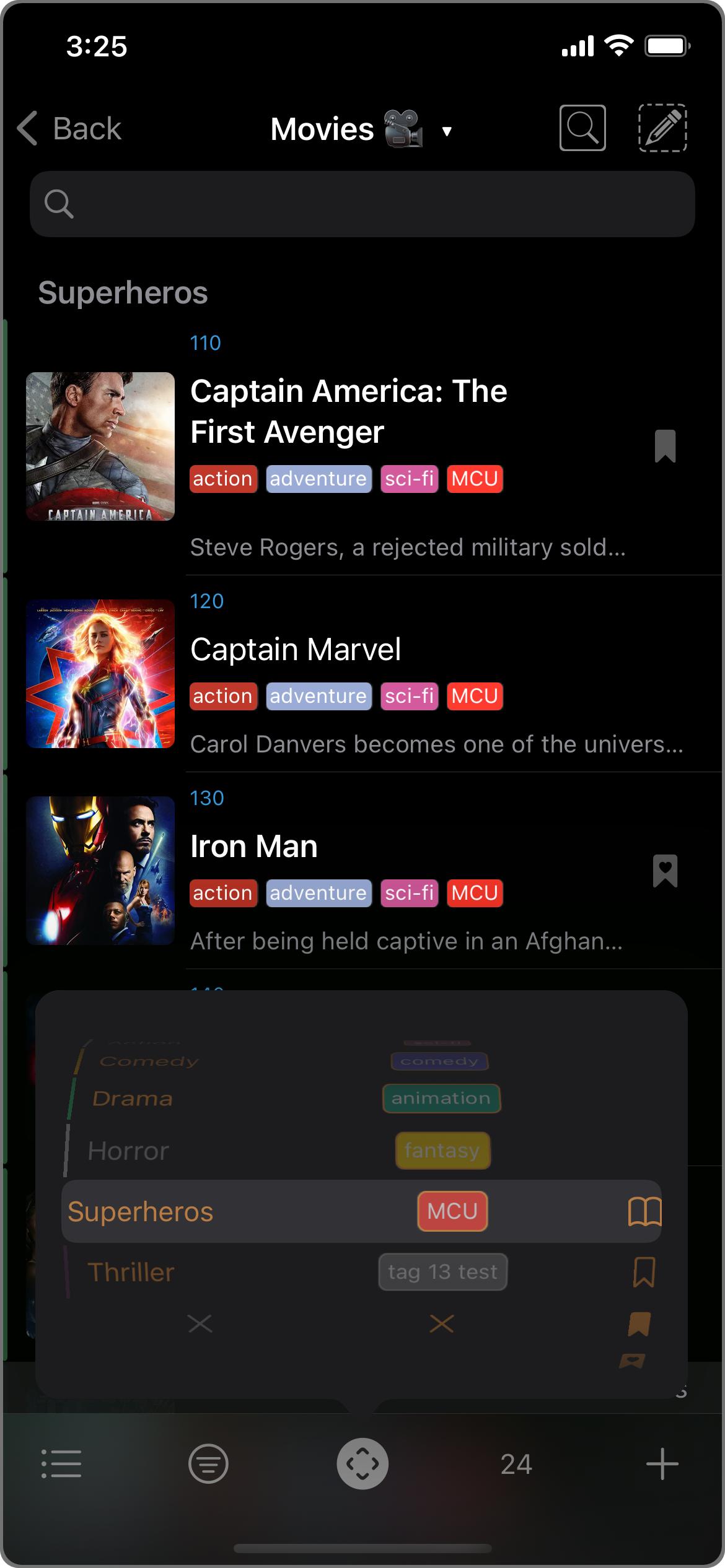
E.g. Picking out Cards in the "Superheros" category and has the "MCU" tag.
Search
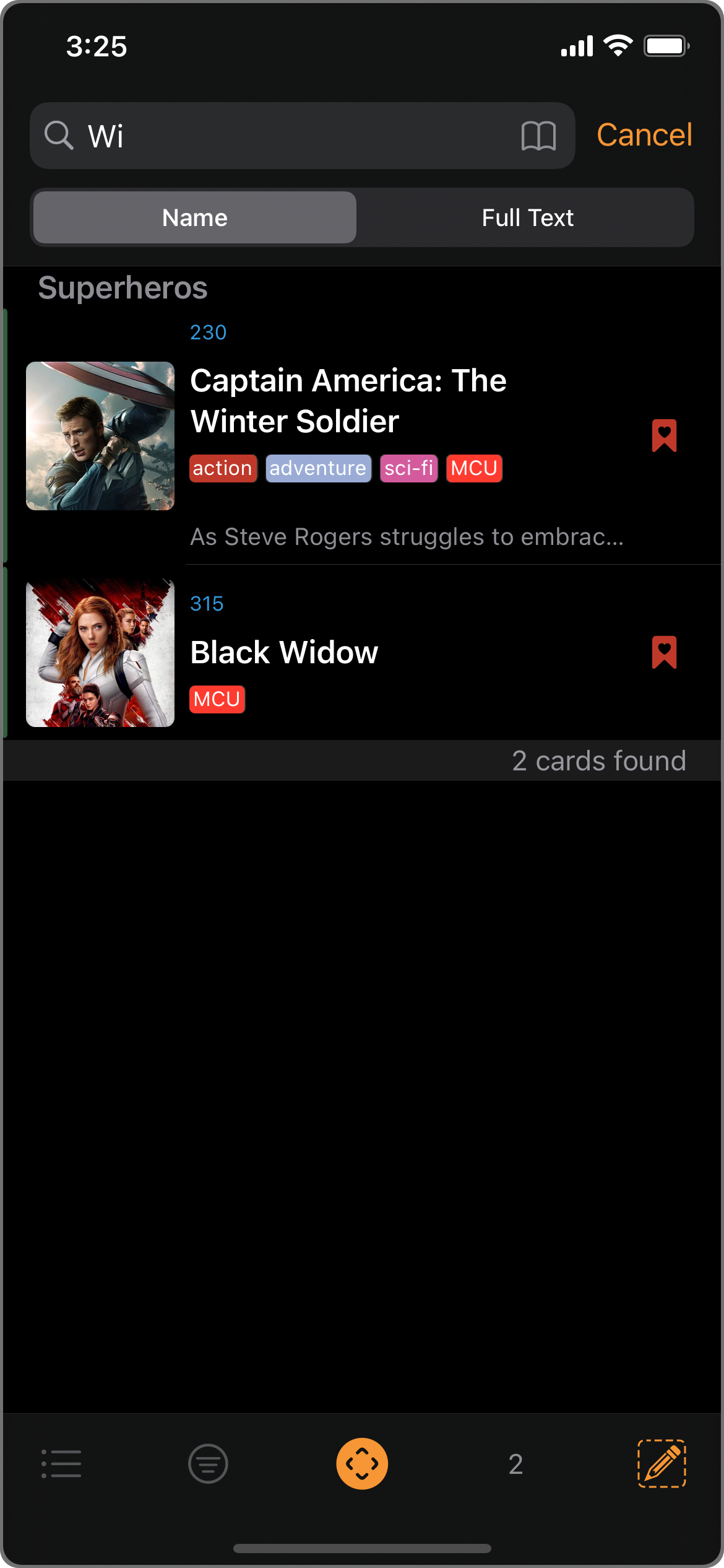
Besides the Picker, you can also use Search to find or narrow down cards. You can search by name, or by any indexed keywords using Full Text Search (FTS).
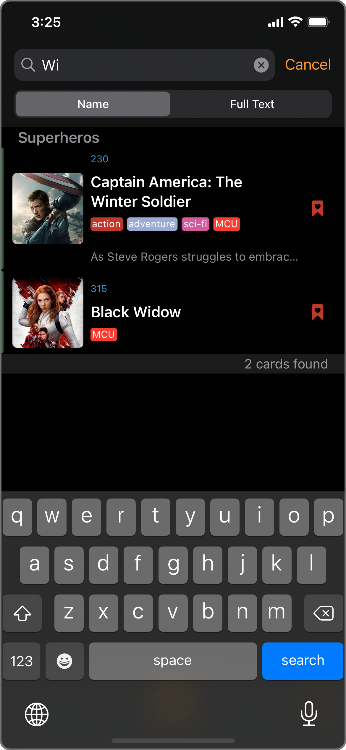
E.g. Find any Cards in the current Deck whose name contains "Wi".
Wildcard! Try typing in "*" in the search field...
Combining Picker & Search
Creating a new Card (C)
Tap the Add button (bottom right) to create a new Card.
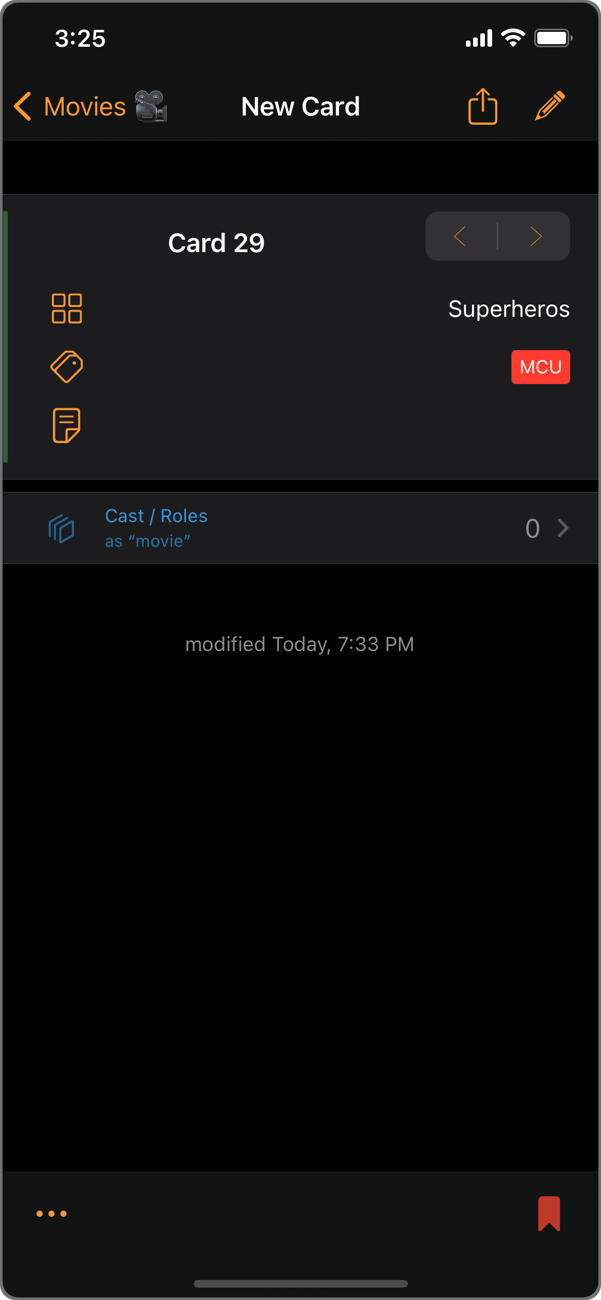
A New Card window.
The Picker's power still shines here! Its AutoFill will fill in the Picker's currently selected category, tag, and mark.
In this example, since the Picker was active, the new Card is AutoFilled with the "Superheros" category, the "MCU" tag, and a "marked" status.
Use the Card Auto-Naming Mode and the New Card template in Settings: Naming to customize the pre-filled name.
Editing Cards (U)
Select/Edit mode
Tap the Edit button (upper right) to enter Select/Edit mode.
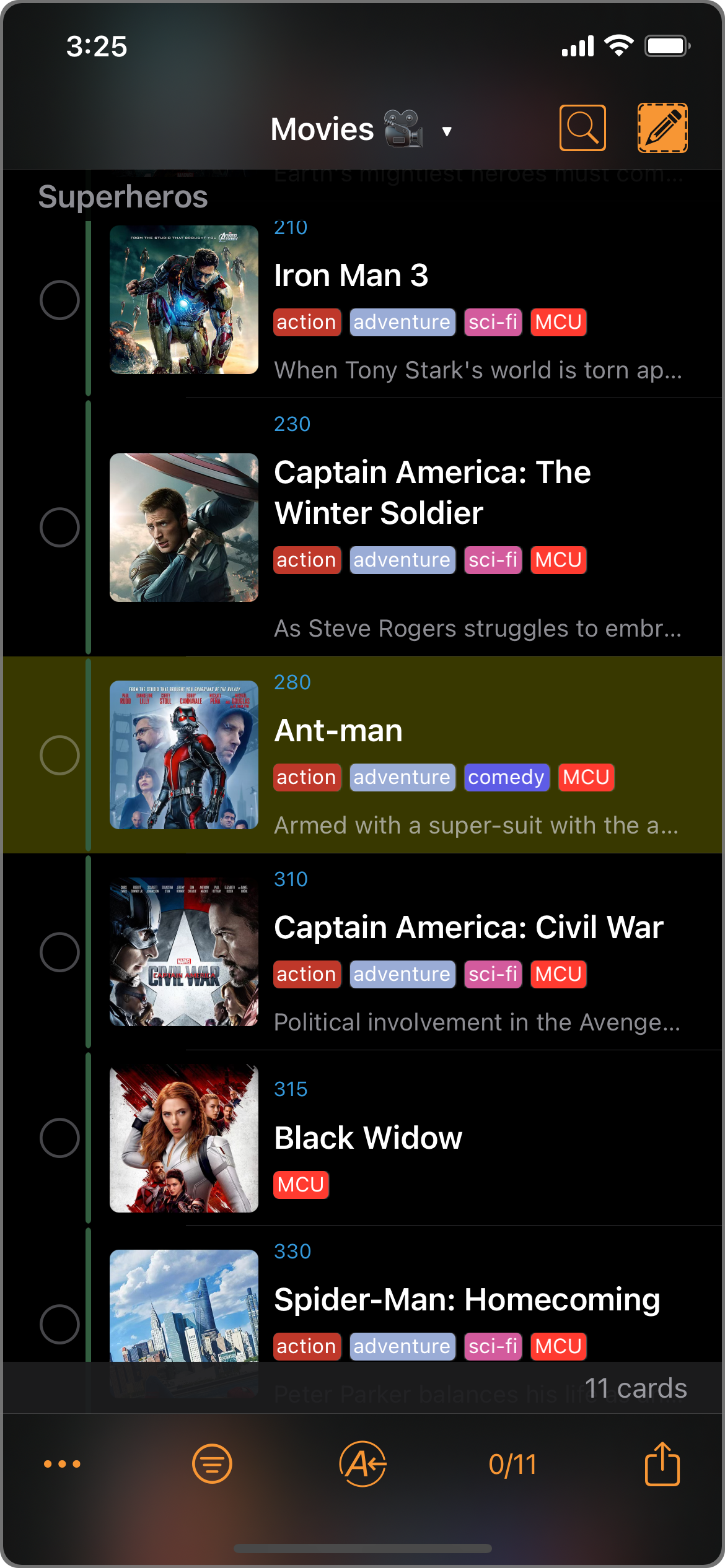
Deck of Cards in Select/Edit mode.
Multiple selection is supported. Tag on the Cards to select them.
Assign Picker
In Select/Edit mode, the Picker becomes an Assign Picker.
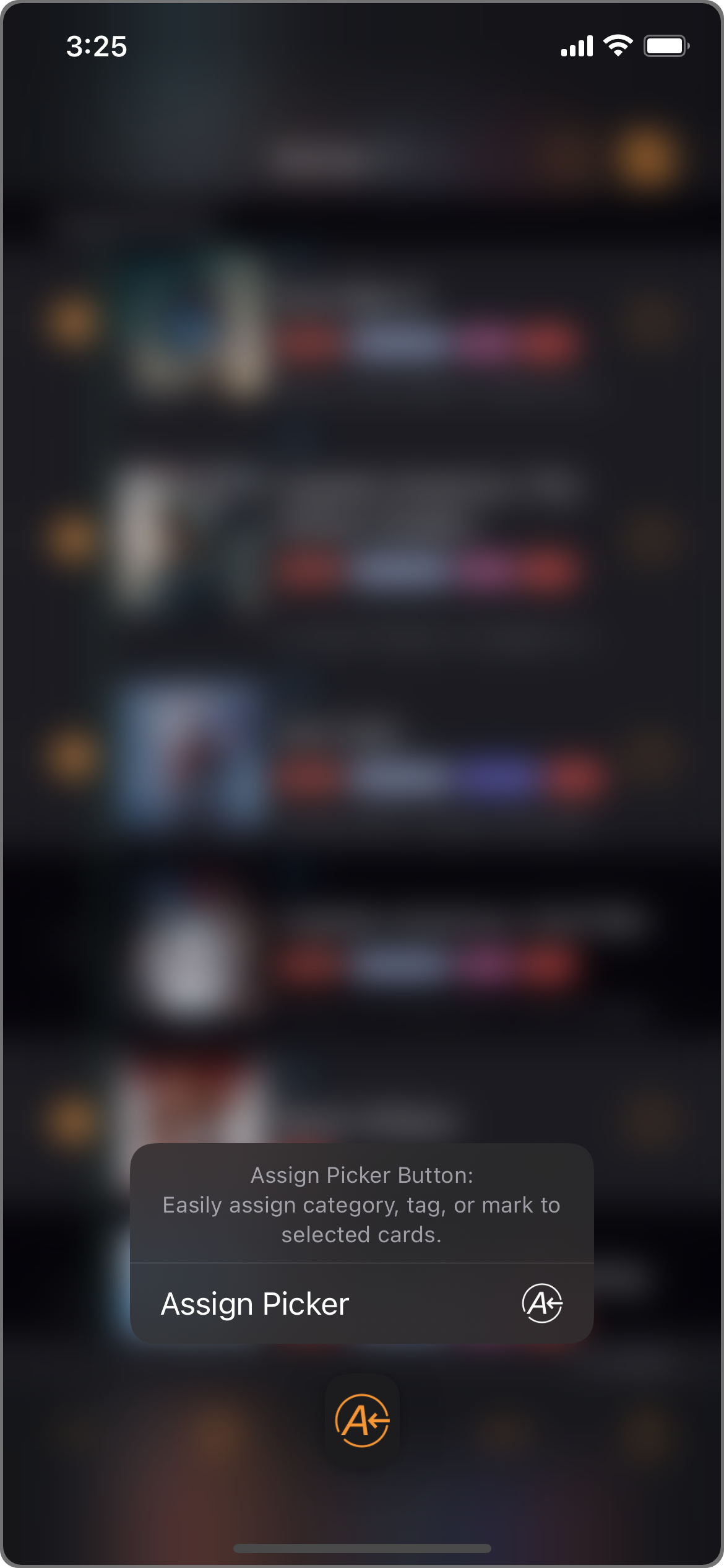
The Assign Picker button's context menu.
After selecting at least one card, Assign Picker allows you to batch assign category, tag, or mark to all selected cards.
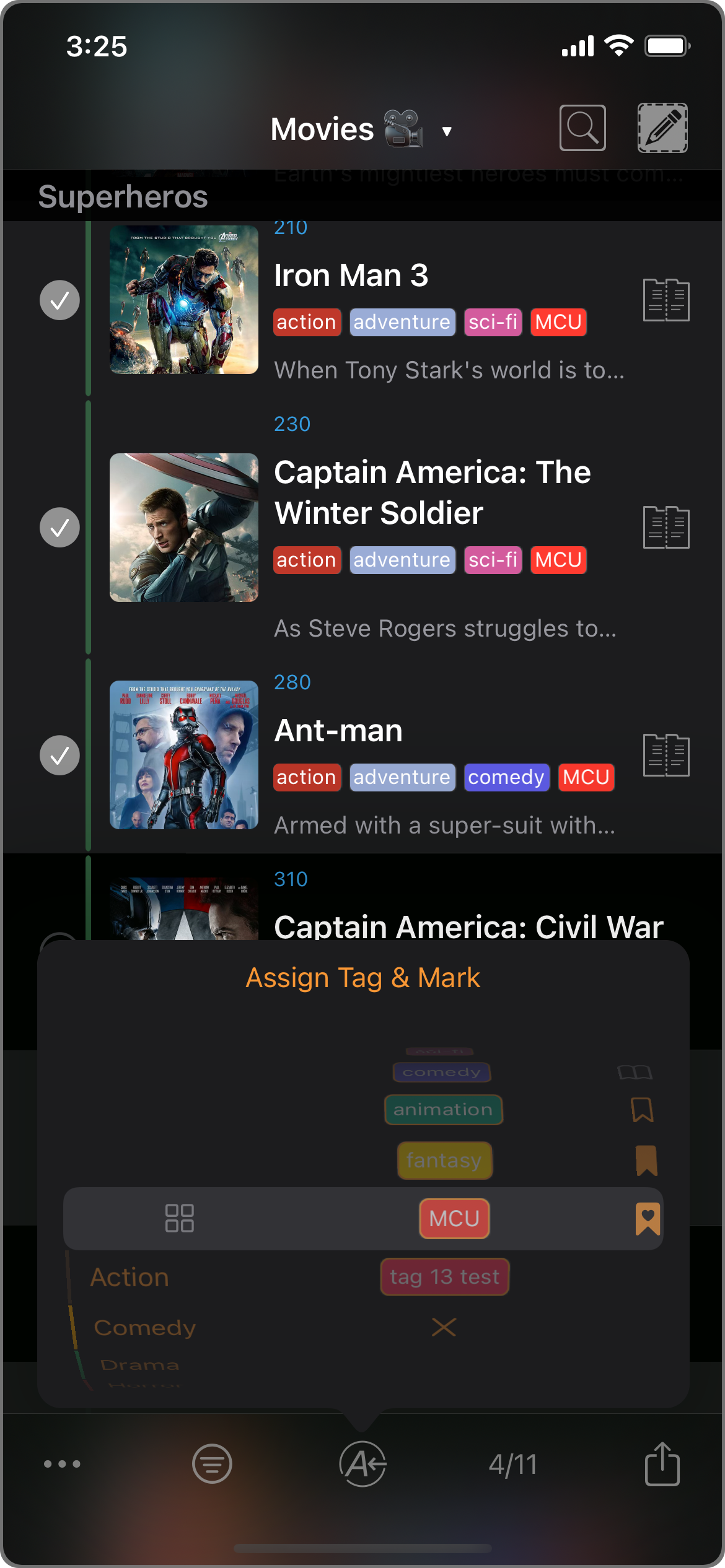
E.g. Tap the "Assign Tag & Mark" button to batch assign to selected cards.
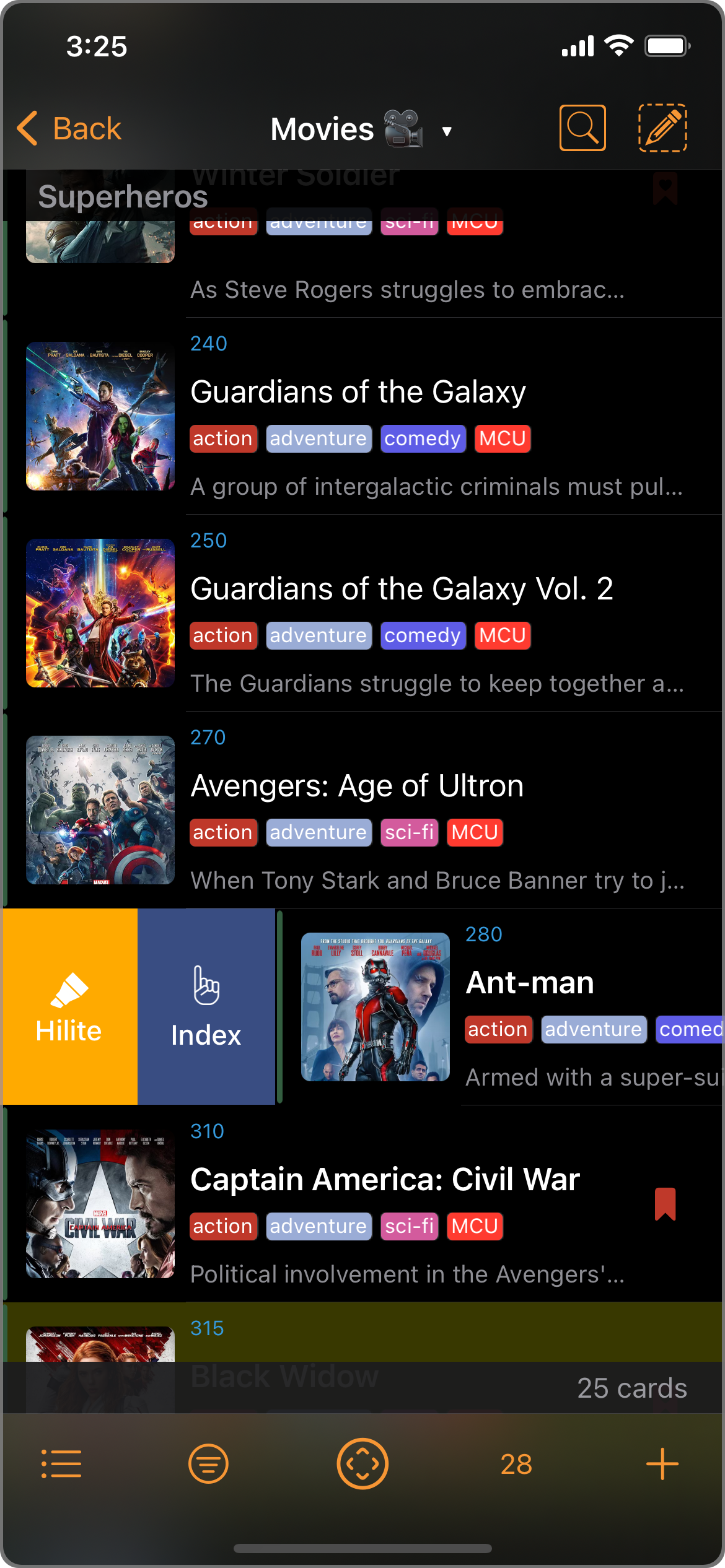
Context menus
More functionalities are surfaced in the context menus.

e.g. The Ant-man card's context menu.
Highlight / Unhighlight
You can highlight any Card to make it look more distinguished.
Swiping shortcuts
- Swipe right
- Swipe left
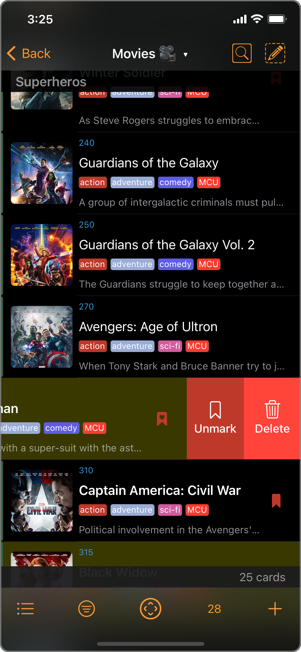
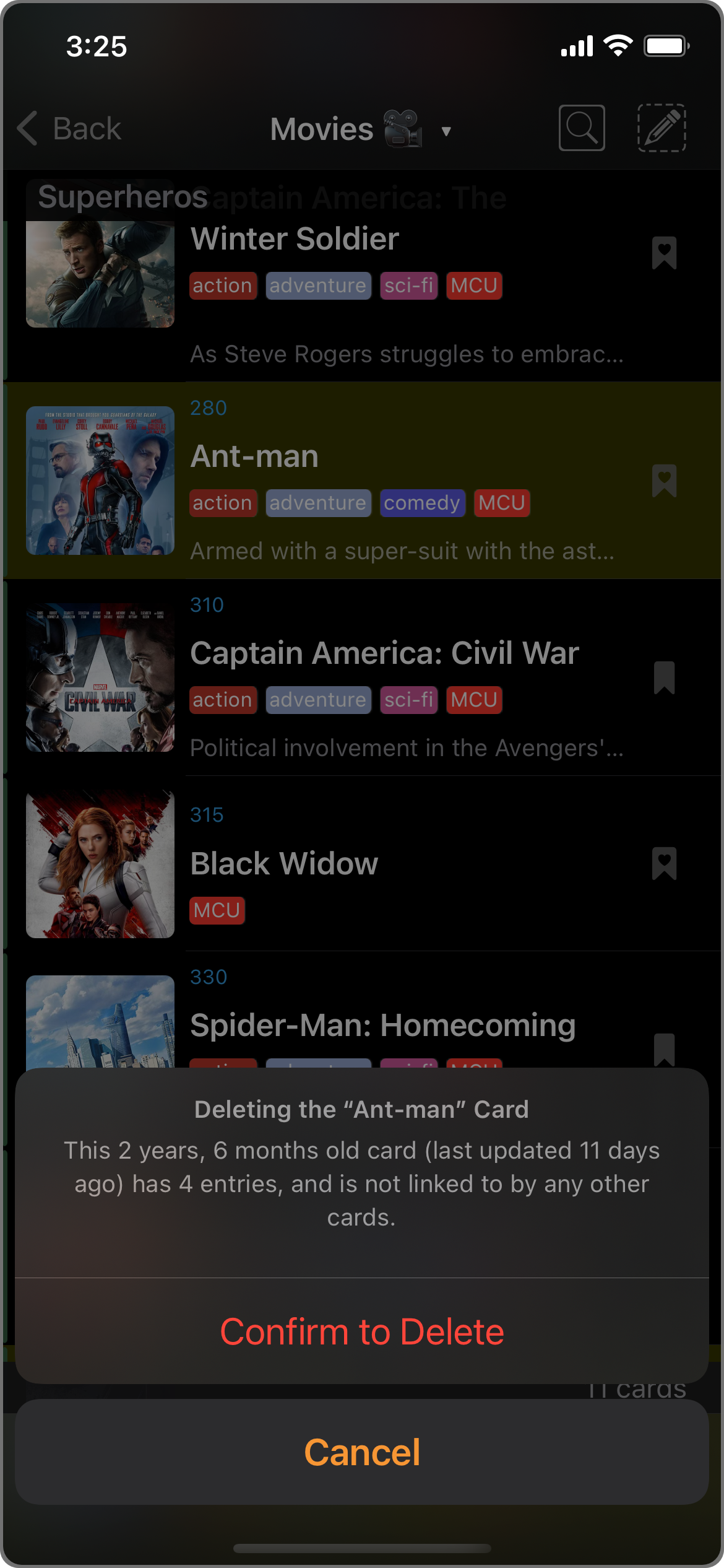
Deleting Cards (D)